Post
Ripples on the
Cosmic Pond
23 August 2012
Time for more on the cosmic microwave background (CMB). This time for something really cool. You’ll remember that the CMB isn’t perfectly uniform, but instead has little variations in temperature. Some regions are slightly hotter, and some slightly cooler. This is similar to having ripples on the surface of a pond, where some parts of the surface are slightly higher than the average pond-level, and some slightly lower.
The pond analogy is a pretty good one, because you could imagine studying the ripples to figure out what caused them. If you could show, for example, that ripples moved out in circles from a central point, you would know that a stone was dropped in the water there. If you measure the size of the largest ripples, and know their speed, you could calculate when the stone was dropped. You could look at other ripples and figure out they were caused by the wind, and maybe a large ripple caused by a passing boat.
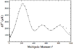
We can do a similar thing with the CMB. The way we do it is by looking at the power of the CMB at different scales, called a power spectrum. In mathematical terms we expand the ripples into a sum of multipole moments. Basically just take the total average temperature of the whole sky, then you split the sky into two regions and take an average of each section, then split and average again, and so on. Keep doing that, and you get an “average” temperature at each scale, which you can see in the figure below.
Now some scales are more powerful than others, and that tells us about what factors are causing the ripples. Using our pond analogy you might have more little ripples on the pond than big ones, which would tell you that more stones cause the ripples than boats. For the CMB, the effects are things like the value of the Hubble constant, how much dark energy and dark matter you have, etc.
 BK
BKIn the figure here, I’ve not only plotted the observed power spectrum as data points, I’ve also plotted a theoretical curve that agrees with the data. This theoretical curve is the shape you’d expect for a universe that is 74% dark energy, 22% dark matter, 4% regular matter (stars, planets and us), and is about 13.7 billion years old. We have other ways of determining each of these values, and they agree with these values.
The amazing thing is that all these values fit in this single curve. If the values were different the peaks would shift left or right, or be higher or lower. While the image of the CMB is wonderful, with its swirls of color, this graph is even more wonderful. It tells us that our understanding of the universe is on track.
Not bad for looking at ripples in our cosmic pond.