Blog
National Geographic Effect
20 October 2014
 NASA
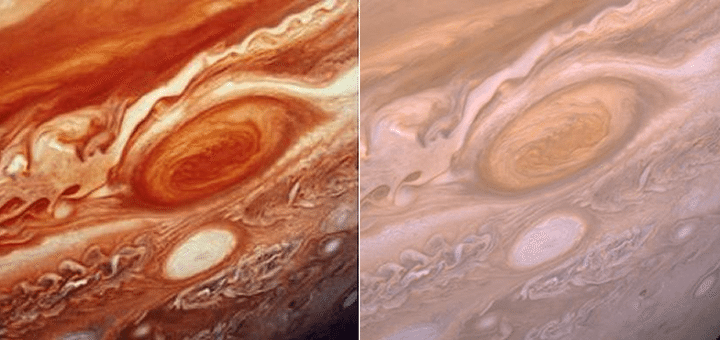
NASAIn the late 1970s the Voyager missions made their flyby of Jupiter. It was the first time truly detailed images were gathered of the planet (even more detailed than the Pioneer images) and they created quite a stir. These detailed images appeared all over the media, but were perhaps most widely seen as full page color photographs in National Geographic. But rather than using true-color images, the photos in National Geographic had boosted colors and depth. It made for great imagery, but wasn’t a true representation of how Jupiter looks. When this color enhancement was pointed out, it was sometimes referred to as the National Geographic effect.
You can see this effect in the image above. On the left is a Voyager II image of Jupiter’s great red spot as it appeared in NatGeo and elsewhere. On the right is the same image in its more true-color form. You can see why the colors were boosted. The true-color image lacks much of the depth and richness we like to see in images.
There are some who would argue that enhanced color images misrepresent reality in a way that runs counter to scientific accuracy. We should be honest and strive for accurate images rather than color-hyped images that are more art than science. That view has gained significant traction since the 1970s, and today you can easily find true-color images of many celestial objects.
 NASA/GSFC/Arizona State University/J. Major
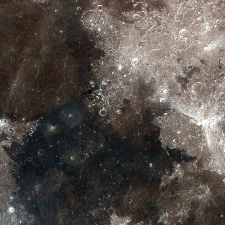
But on the other hand, in some ways a color-hyped image is more accurate to what we perceive, even if it isn’t as accurate to reality. Take for example, the color of the Moon. If you asked people the color of the Moon, most would say it is white or pale gray. They would say this based upon their own observation of the Moon. It appears pale gray when you look at it in the night sky. In reality, the moon is a much darker shade, with the “white” regions more the color of gunpowder, and the darker regions the more color of asphalt. A similar effect occurs with Mars. We see it in the sky as pale red, but it is actually more the color of butterscotch or cocoa powder.
 ESA’s Rosetta Blog
Part of the reason for this discrepancy is that we don’t perceive colors as absolute, but rather relative to surrounding colors. Against the background of black sky, colors appear brighter and more pale. The actual brightness of an object is related to its albedo, or the fraction of light striking an object that reflects off its surface. We normally adjust for albedo in photographs, so we don’t notice the variation. For example, Saturn’s moon Enceladus is a brilliant white body that reflects nearly 100% of the light striking it. The comet 67P/Churyumov–Gerasimenko is also photographed as a bright white object, but has an albedo of only 5%. Compared to Enceladus, 67P is as dark as a lump of coal. But even a lump of coal would be brighter than the dark of space, so showing it as a brighter gray object is more realistic.
Although we can strive for accurate “true-color” representations of celestial objects, they will never be entirely like the way they would appear to us in real life. Even our spacecraft don’t take color images. Instead they take grayscale images at various wavelengths, which can be combined to create color images. Whether we generate more brilliant or more true images is a matter of preference.