Blog
The Illusion of Reality
22 May 2015
One of the most impressive aspects of astronomy is the stunning visuals. These amazing color images inspire our love of the cosmos, and are a perennial hit on social media. They also aren’t real, at least in the sense of being an accurate representation of how celestial objects actually appear to the human eye. They are more art than science, providing an illusion of reality.
The reason for this is rooted in the way astronomers observe the heavens. At a basic level, astronomers image the sky in much the same way you might take a selfie with your phone. Both are captured with a digital camera, and both are manipulated to produce the desired result. But in astronomy we’re primarily interested in accurate data, which means creating an image often comes second.

If you take a photograph with your phone, for example, it’s typically stored as a jpg file. In this format, images are compressed to reduce their size, and the way in which they are compressed is “lossy.” This means part of the image is approximated, which loses some of the information in the image. For selfies the approximation isn’t noticeable, so this isn’t typically a big deal. For scientific imagery, however, you don’t want approximations; you want to preserve 100% of the available information you worked so hard to collect. So astronomers typically use a different image format known as the Flexible Image Transport System (FITS).
The FITS format is uncompressed, and stores data as a text (ASCII) file. This means you can easily analyze the data or convert it to other file formats. The files can also contain metadata, or information about how and where the image was obtained, which is particularly useful when you need to combine data from multiple sources.
 Brian Koberlein
One disadvantage of the FITS format is that raw images typically need to be manipulated to show anything. For example, a file might give the amount of light gathered for each pixel on a linear scale. When displayed on a screen the raw image often looks black because our eyes perceive brightness on a logarithmic scale. To actually see the image of a faint galaxy, above, we have to severely adjust the brightness and contrast.
Another difference between your typical selfie and an astronomical image is the way in which color images are produced. Digital cameras detect light through an array of sensors that measure the amount of light reaching them (typically CMOS or CCD detectors). These sensors are sensitive to light within a particular range of wavelengths. Most commercial digital cameras also implement an array of filters so that some pixels will only capture red light, and others only green or blue. The three “color” images are then combined to produce the color photograph. This is similar to the way our eyes perceive light, with cones in our retina sensitive to these three primary colors.
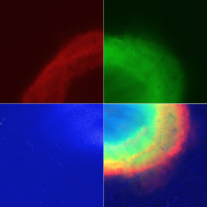 Hubble/Brian Koberlein
color image (bottom right).
While this is an easy way to produce a color image, its big downside is that each type of sensor is only capturing a fraction of the light. It also means that the amount of light gathered at each wavelength is determined by the ratio of red, green and blue sensors, and can’t be changed. Since astronomers want to gather as much light as possible, their cameras are sensitive to a wide range of wavelengths. Different filters can then be placed in front of the sensors if we want to focus on a particular color range. As a result, raw photographs in astronomy are almost always black and white.
To create a color image, black and white images taken through different filters are then colorized and combined to produce a color image. With the right care it’s possible to create an image which closely approximates a “true color” image. But often the resulting image doesn’t accurately represent the real colors of the night, and often this is done intentionally. It’s sometimes referred to as the National Geographic effect.
In the late 1970s, the Voyager missions made their flybys of Jupiter. It was the first time truly detailed images were gathered of the planet. Magazines such as National Geographic had full page spreads of these images, which were absolutely stunning. Then, as now, the raw data were black and white images captured through different color filters, which were combined to create color photographs. But rather than using true-color images, the photos had boosted colors and depth. It made for great imagery, but wasn’t a true representation of how Jupiter looks.
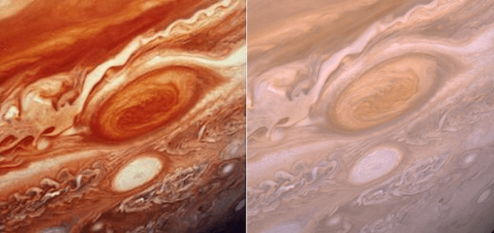 NASA/JPL
There are some who would argue that these enhanced images misrepresent reality in a way that runs counter to scientific accuracy. Shouldn’t we be honest and strive for accurate images rather than color-hyped photographs that are more art than science?
While there’s a case to be made for accuracy, in some ways a color-hyped image is more accurate to what we perceive, even if it isn’t accurate to reality. By changing the contrast on these images, we can visually perceive details that would be washed out if we insisted on “true color” all the time. If you asked people the color of the Moon, for example, most would say it is white or pale gray. They would say this based upon their own observation of the Moon. But in reality, the Moon is a much darker shade that borders on black, more the color of gunpowder. A similar effect occurs with Mars, which we see in the sky as pale red, but is more the color of butterscotch or cocoa powder. The reason for this discrepancy is that our perception of colors depends on other factors such as the brightness of an object, or the colors of objects next to it.
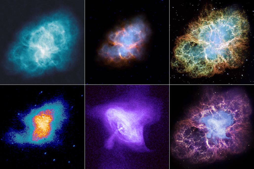 Brian Koberlein
Bottom Row (left to right): ultraviolet, x-ray, and a false-color composition of the full range.
Then there are the vast range of wavelengths that our eyes can’t even observe. We’ve developed telescopes that can see radio, infrared, ultraviolet, x-rays and gamma rays. Accuracy would ask that we remain blind to these images. But instead we produce false-color images, where colors are assigned to various wavelengths. This allows us to perceive structures that wouldn’t be apparent otherwise, structures that in many ways describe what’s physically present better than what our eyes would see alone.
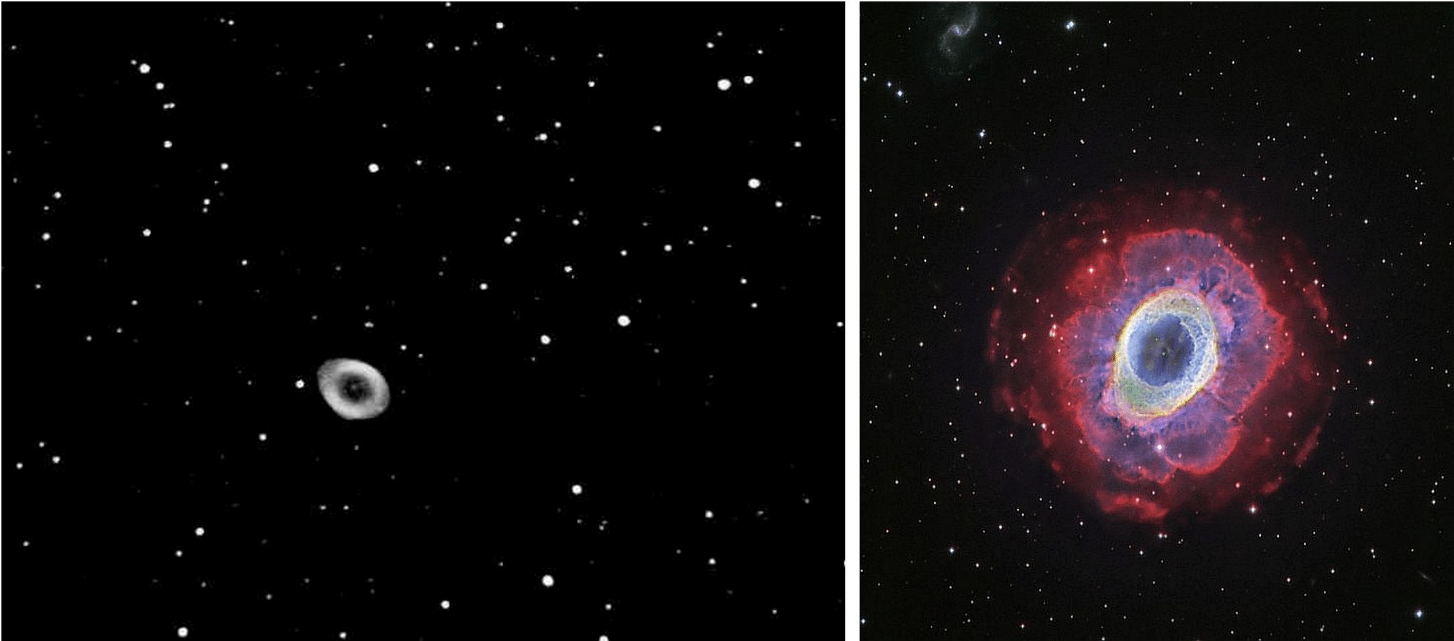 Chris Spratt (L); D. López (IAC) (R)
Compare what the human eye sees of the Ring Nebula through an eyepiece, at left, with what an advanced telescope and camera (the Isaac Newton Telescope’s Wide Field Camera) — with advanced processing, multiwavelength views, spectroscopic data and the contrast turned way up — sees at right.
Pictures tell a story, and sometimes the power of these images lies not in being true to life, but rather in extending our view of the universe beyond the limits of the human eye.